Design Process
User Demographics
Age : 18-50 Years
Gender : 3 Males, 3 Females
Nationality : American, Asian, African
User Needs & Goals
"Find and get to destination"
"Lower app time or may be better app interface"
"Swift and efficient features"
"Schedule for current as well as all the transits during the day"
User's Journey
I identified the key specs that had to be included in the website in order to build the MVP, then mapped out user flows based on those specs (a lot of white-boarding was involved). At this point in the process, I found participatory design to be extremely helpful. I actually had end users mapping out their ideal flows, which I was then able to incorporate into my design.
.svg)
Information Architecture
Based on the user flows, I constructed the Information Architecture such that there was a minimal level of difficulty to immediately accessing relevant information. After all, the goal of this product is to enable users to quickly and easily find treatment and send us inquiry.
.svg)
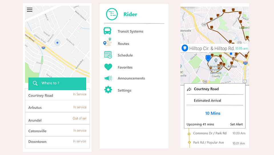
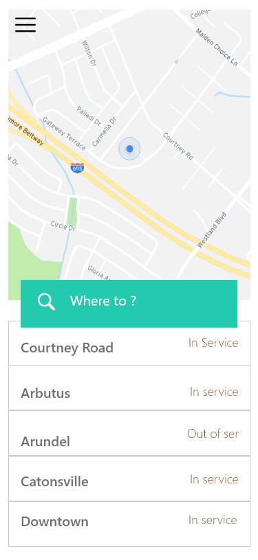
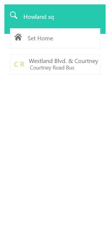
Visual Design
The main components of the overall User Interface are the Home Page, the destination, Choose Transit/ Select Bus Stop/ and the Menu Bar. I have illustrated some of them below.
1. Home Page
2. Enter Start point / Destination

3. Choose bus stop / Transit
4. Choose Bus
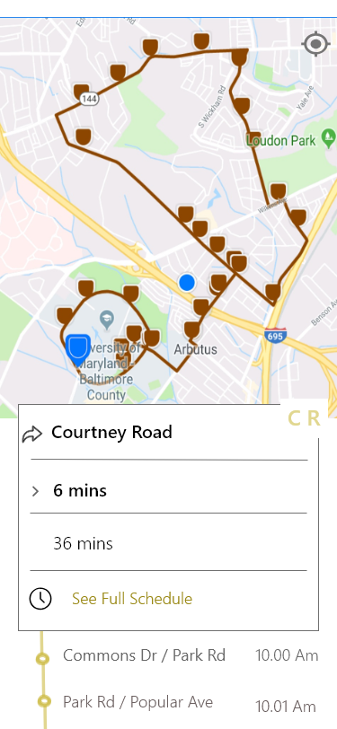
5. Select Bus stop

6. Menu

Reflections and Learning
This was the first project where I not only worked as an Product manager but also an UI Designer. I learned that every problem looks difficult initially, but with right approach and design mindset we can solve any issues and achieve great results. Designing effectively means bridging business needs, technical constraints and finally providing user satisfaction.
Creating a design language which clearly communicates the form and function, and is also aesthetically pleasing which encourages the users to often use the app was a tough nut to crack. Got to learn new collaborative design tool Adobe XD for brainstorming and wire-framing.